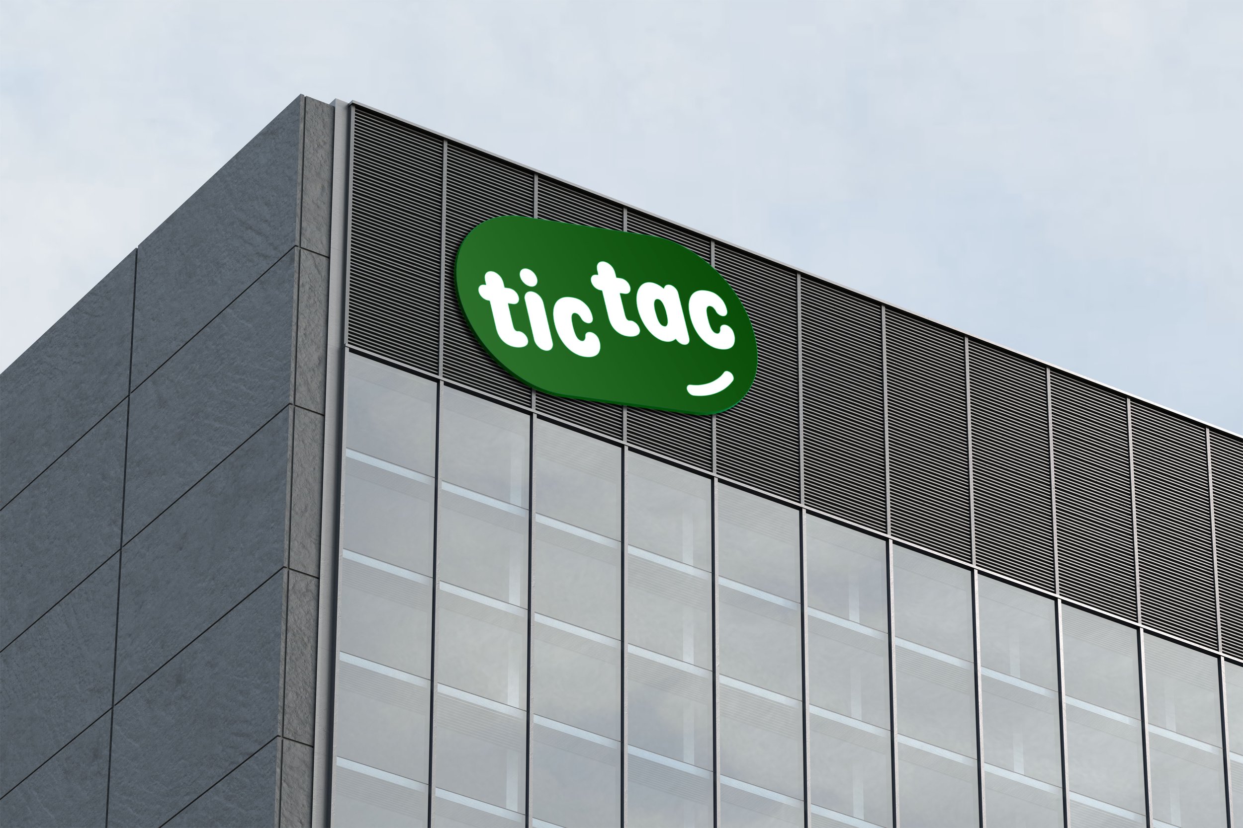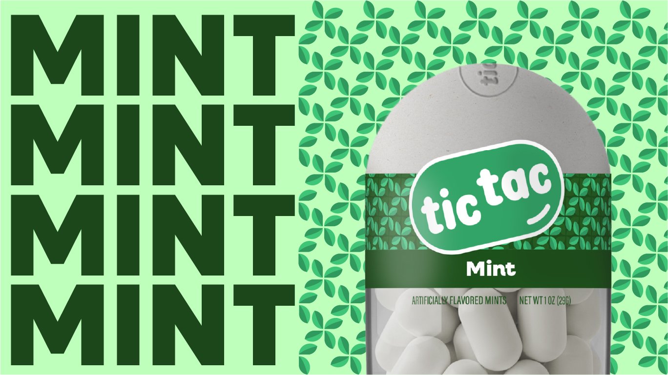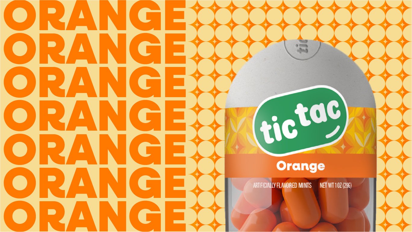
About the rebrand
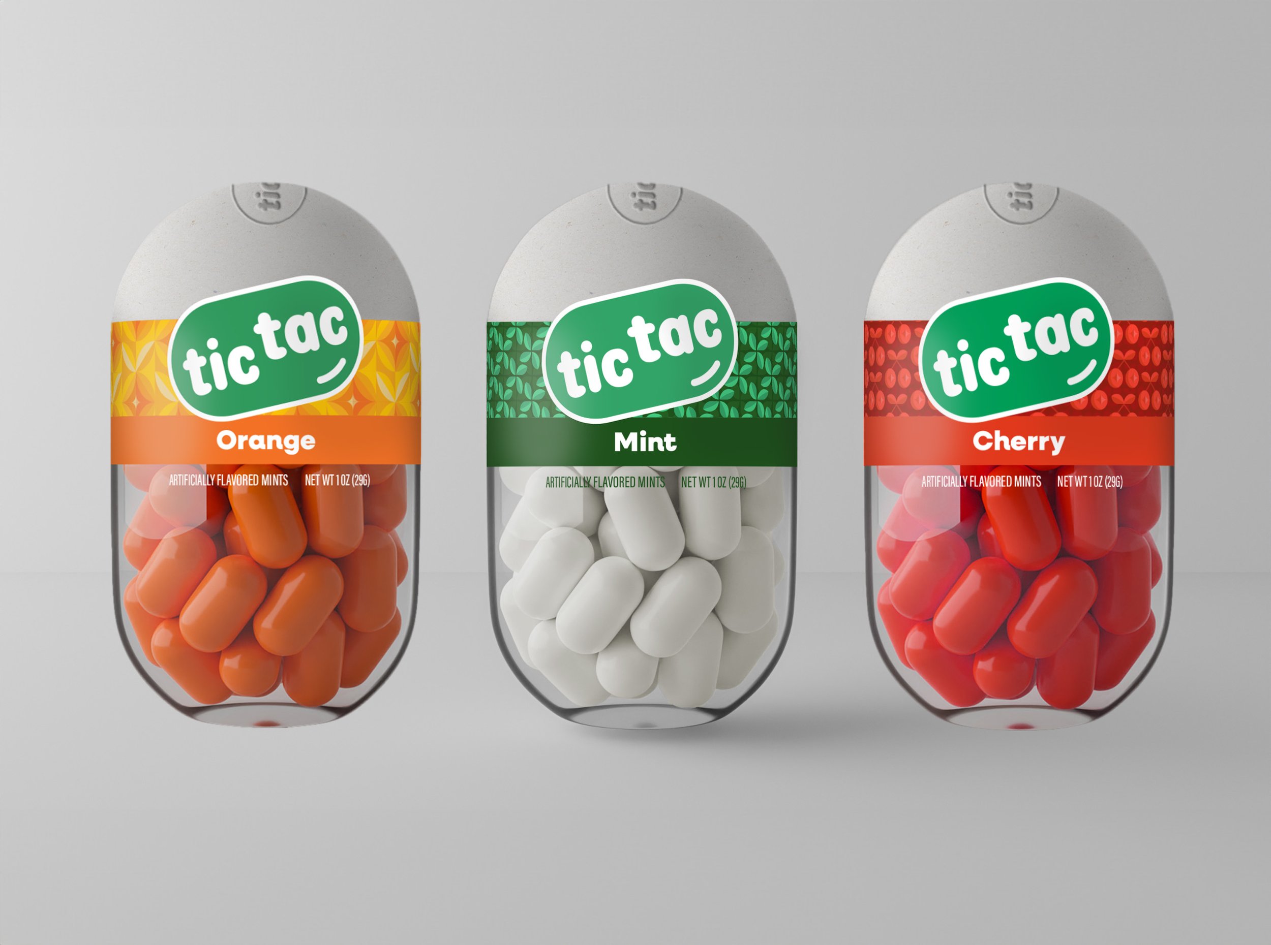
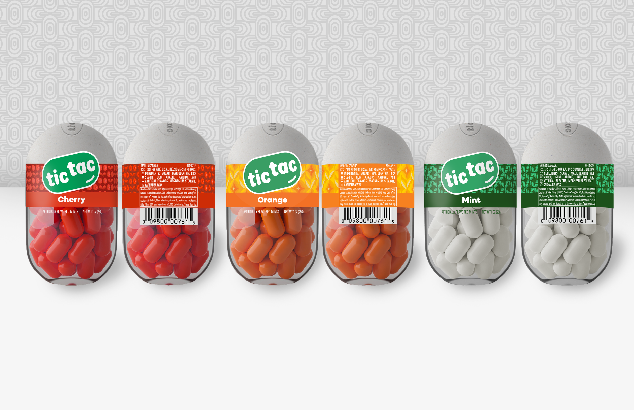
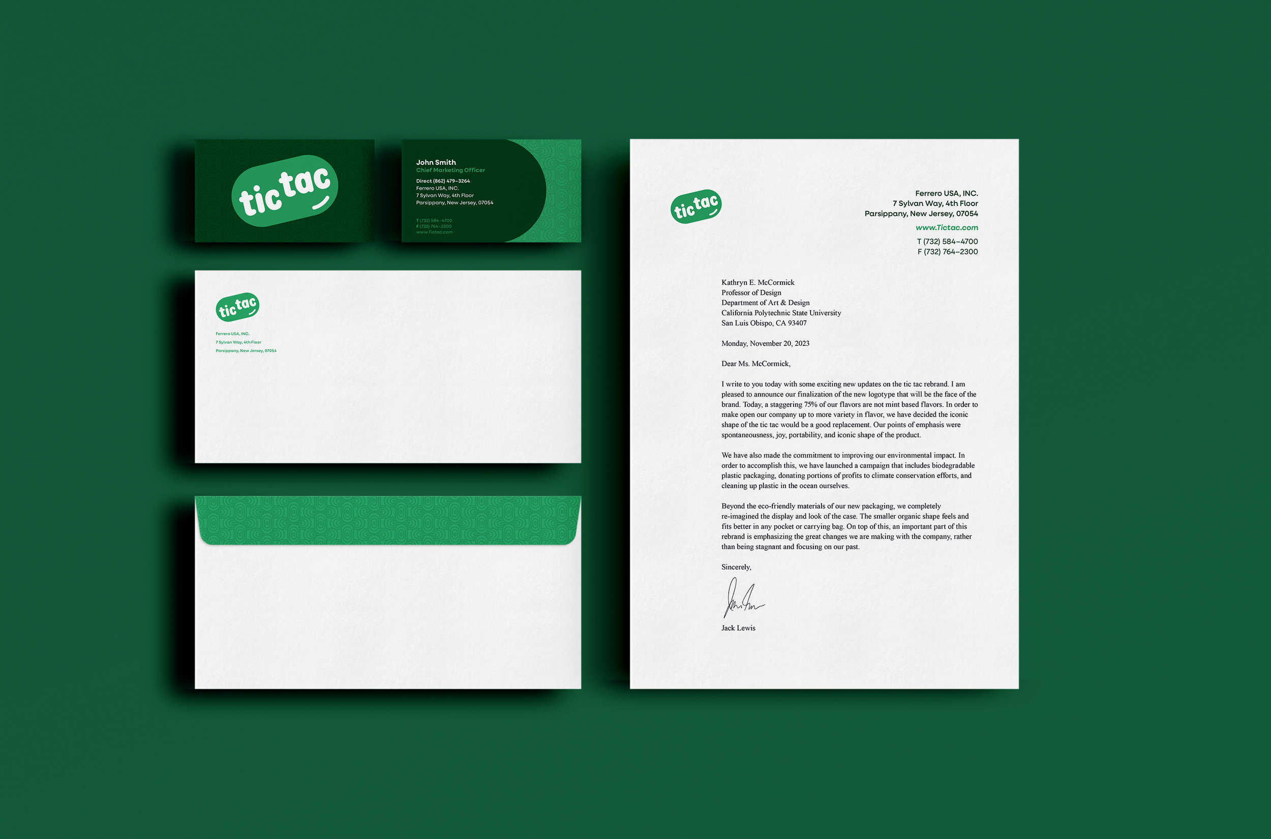
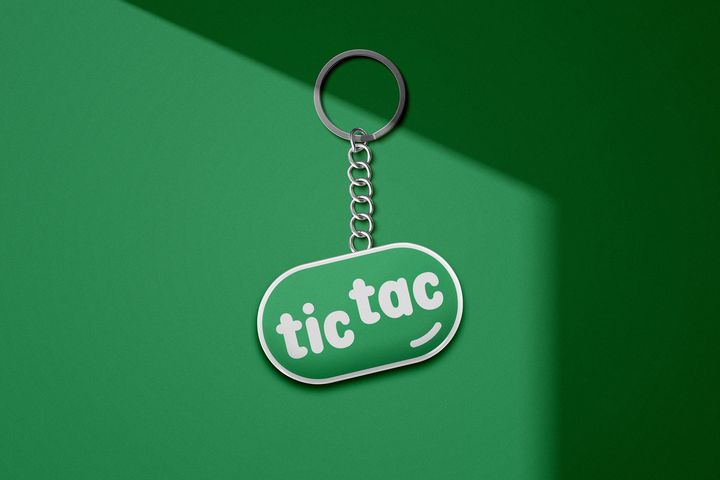
This was a rebranding project for my graphic design class. We were tasked with completely rebranding a company of our choice, and I chose the well-known mint company Tic Tac. I noticed that their logo had not been updated in many years, which made it seem outdated. Since they offer more non-mint flavors than mint ones, I decided to redesign the logo to better represent their range of products. I removed the mint leaf and focused on the unique shape of the product itself. Additionally, I redesigned the packaging to make it smaller and more aligned with the brand.